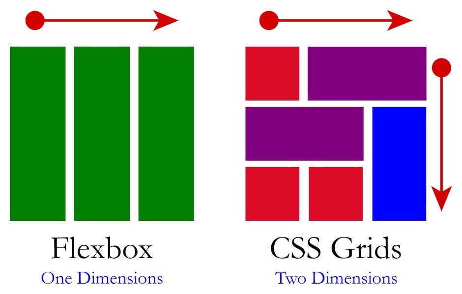
CSS Grid is indeed a powerful two-dimensional framework that allows you to create complex grid layouts in web development. It provides precise control over both rows and columns, making it easier to design responsive and flexible web pages. If you’re looking to advance your skills and transition to CSS Grid, here are some key concepts to keep in mind:
- Grid Container: To start using CSS Grid, you’ll need to define a grid container. This is usually done by applying the
display: gridproperty to a parent element. - Grid Rows and Columns: With CSS Grid, you have control over rows and columns individually. You can define the size, position, and behavior of each grid cell by using properties like
grid-template-rows,grid-template-columns, andgrid-gap. - Grid Items: Once you’ve established a grid container, you can place grid items within it. These items are the children of the grid container, and you can control their placement using properties like
grid-row,grid-column, andgrid-area. - Grid Lines and Units: CSS Grid introduces grid lines, which act as references for placing and aligning grid items. You can use both named lines (e.g.,
grid-template-rows: [row1-start] 100px [row1-end]) and numerical lines (e.g.,grid-column: 1 / span 2) to define the grid layout. - Grid Template Areas: CSS Grid allows you to define named grid areas using the
grid-template-areasproperty. This approach simplifies the creation of complex layouts by assigning names to groups of cells. - Grid Auto Placement: By default, CSS Grid automatically places items in the grid. You can control this behavior using properties like
grid-auto-flowandgrid-auto-columns. This is especially useful when dealing with dynamic or unknown numbers of grid items. - Grid Alignment: CSS Grid provides several alignment properties to control how grid items are positioned within their cells. You can use
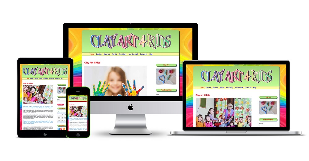
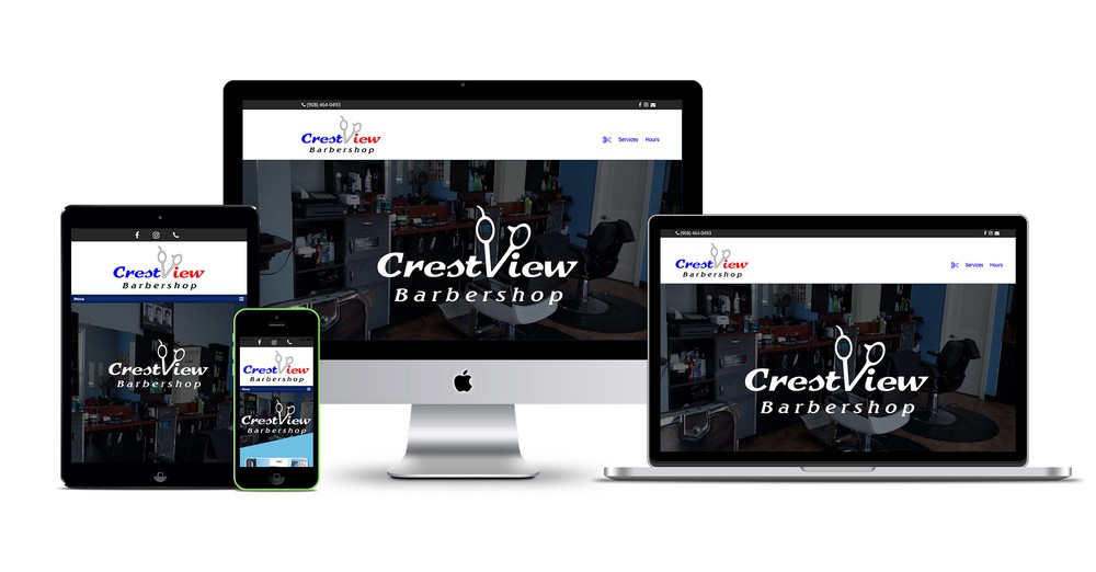
justify-items,align-items,justify-self, andalign-selfto align items horizontally and vertically. - Grid Responsive Layouts: One of the main advantages of CSS Grid is its ability to create responsive layouts. By combining media queries with the flexible nature of CSS Grid, you can adapt the grid structure and item placement based on different screen sizes.
These are just some of the fundamental concepts to understand when advancing to CSS Grid. It’s worth noting that CSS Grid is well-supported in modern browsers, making it a reliable choice for creating sophisticated and responsive web layouts.

