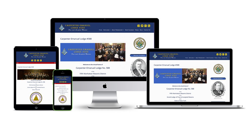
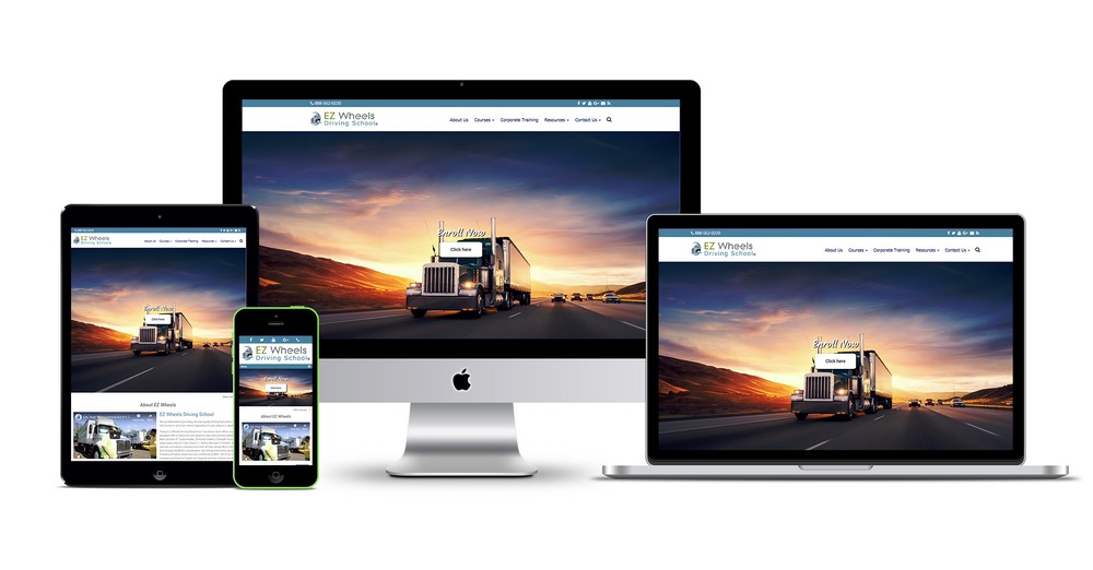
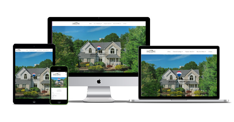
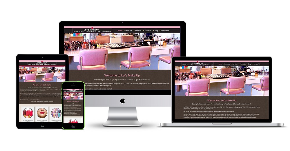
Responsive web design (RWD) has been a cornerstone of modern digital experiences since the early 2010s. But in 2025, we’ve seen a radical shift — not just in layout adjustments, but in how websites respond, learn, and adapt to users dynamically. Let’s take a look at how responsive design has evolved this year and where it’s heading.
A Quick Recap: What is Responsive Design?
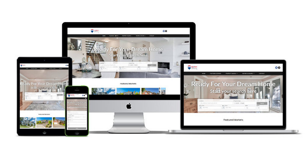
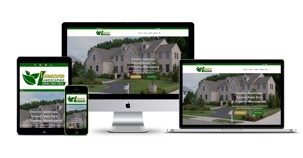
Traditionally, responsive design refers to a website’s ability to automatically adjust its layout and elements based on the user’s screen size — whether desktop, tablet, or mobile. Techniques like flexible grids, media queries, and image scaling were the backbone of this approach.
Fast forward to 2025, and the expectations have expanded well beyond screen size.
What Changed in 2025?
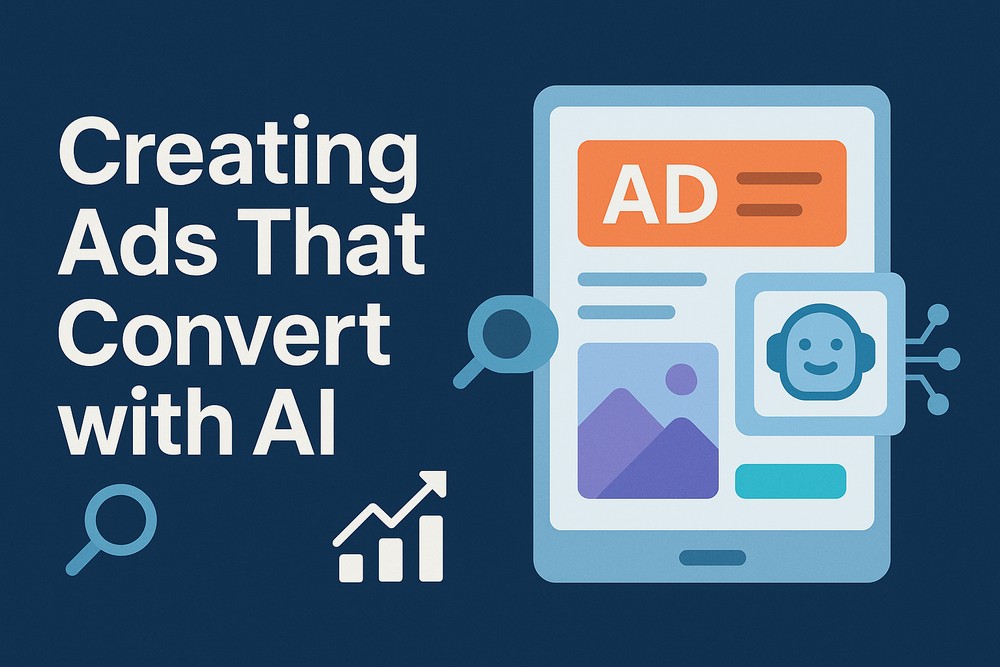
1. AI-Powered Personalization Became the Norm
In 2025, the biggest evolution in responsive design is responsiveness to context, not just screen size. Websites now use AI to analyze:
- User behavior patterns
- Device capabilities
- Geographic and environmental data
- Real-time interaction data
This means that instead of showing the same mobile layout to everyone, websites now intelligently adapt content based on who’s visiting and how they’re interacting.
2. Voice and Gesture Interfaces Are Integrated
With the rise of wearable tech and smart devices, web designers are now optimizing interfaces for voice navigation and even gesture control. Think “responsive design” that changes layout or offers alternate UI elements when accessed through AR glasses or smart rings.
3. Container Queries Finally Took Off
After years of debate and development, container queries have become mainstream. These allow components to respond to their own size rather than the size of the entire viewport, unlocking modular, adaptive design systems. This made design systems much more scalable and reusable in component-driven frameworks like React and Vue.
4. Dark Mode, Accessibility, and Preference-Based Design
Designs now automatically respond to:
- User system preferences (dark/light mode)
- Accessibility settings (reduced motion, large text)
- Cultural preferences (RTL vs LTR languages, color associations)
It’s not just about layout anymore — it’s about responsive UX.
5. Hyper-Localized and Real-Time Content
Content delivery is now tied to micro-geolocation and real-time data. A retail site, for example, might adjust its promotions based on current weather, local events, or even the user’s past behavior in a specific region.
6. Fluid Typography and Micro-Interactions
Typography is now fluid, not just scalable — with variable fonts adapting in weight, width, and even mood depending on device and context. Meanwhile, micro-interactions (animations, feedback, transitions) are responsive to touch sensitivity, input speed, and user intent.
Tools & Frameworks Leading the Way
Some of the 2025 power players in responsive design include:
- StyleX (Meta’s responsive styling engine) – Now widely adopted for atomic, responsive styling.
- Framer AI & Webflow 3.0 – Leading the charge in AI-driven layout creation.
- Tailwind CSS with container query support – Making it easy to build intelligent layouts without bloated code.
The Future of Responsive Design
The definition of “responsive” is being rewritten. No longer just a technical technique, it’s now a strategic layer of personalization and interaction. In 2025, a truly responsive website:
- Understands its user
- Responds in real-time
- Optimizes for both context and content
- Feels more like a product experience than a static page
As AI, AR, and device diversity continue to grow, the web of the future will be more fluid, intuitive, and intelligent than ever.
Final Thoughts
2025 has marked a pivotal year for responsive design, one where we’ve moved beyond layouts and into experiences. For designers and developers, this shift opens up exciting possibilities — and a fresh set of challenges. The key to success? Stay adaptable, user-focused, and open to reimagining what the web can be.