Designing the right color palette is an important aspect of creating visually appealing and harmonious designs. Here are some steps to help you design a color palette:
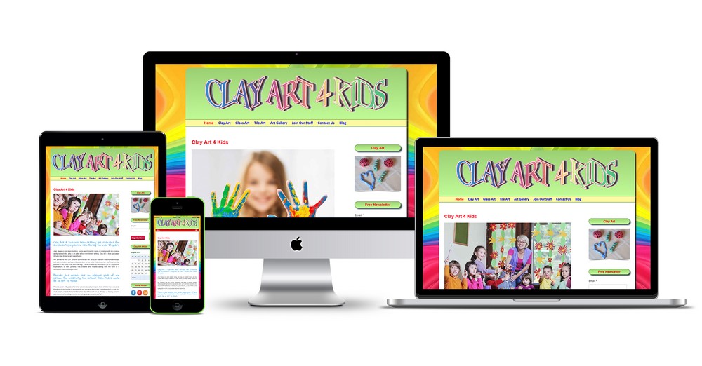
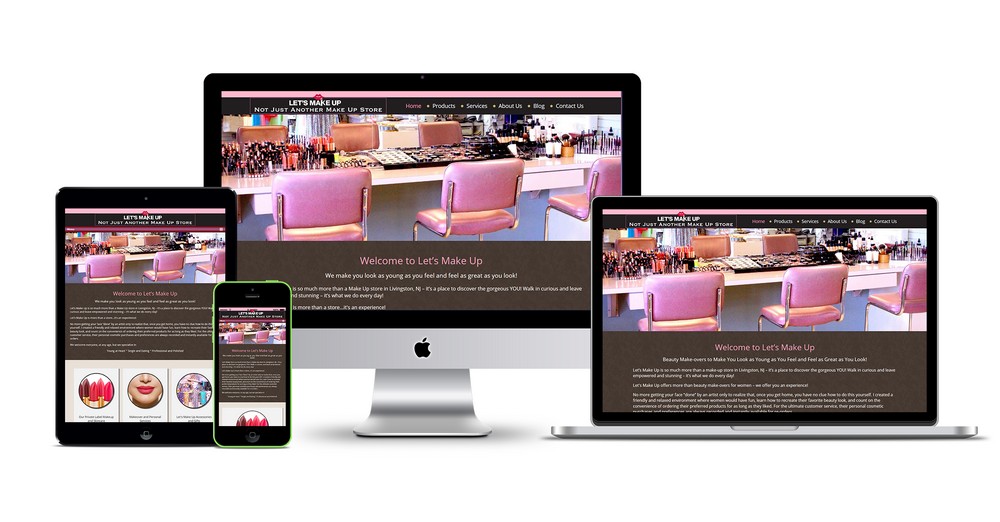
- Define the Purpose and Mood: Determine the purpose of your design project and the mood you want to evoke. Consider the emotions and feelings you want the color palette to convey. For example, calming and soothing colors may be appropriate for a spa website, while vibrant and energetic colors might be suitable for a sports brand.
- Understand Color Theory: Familiarize yourself with the basics of color theory. Learn about concepts such as the color wheel, color harmonies, and color relationships. This knowledge will help you create balanced and visually pleasing color combinations.
- Start with a Base Color: Select one or two base colors that align with the purpose and mood of your design. These colors will form the foundation of your palette. You can choose colors that reflect the brand identity or consider the psychological associations of different colors.
- Explore Color Harmonies: Use color harmonies to expand your palette and create harmony among the colors. Some common color harmonies include complementary (colors opposite each other on the color wheel), analogous (colors next to each other on the color wheel), and triadic (three evenly spaced colors on the color wheel). Experiment with different harmonies to find the right combination.
- Consider Contrast: Ensure your color palette has enough contrast to make your design elements stand out. Contrast helps with readability and visual hierarchy. For example, if you’re designing a website, make sure the text color contrasts well with the background color.
- Use Shades, Tints, and Neutrals: Incorporate shades (adding black), tints (adding white), and neutrals (such as grays and browns) to add depth and balance to your palette. This allows for variations in color and prevents your design from appearing flat.
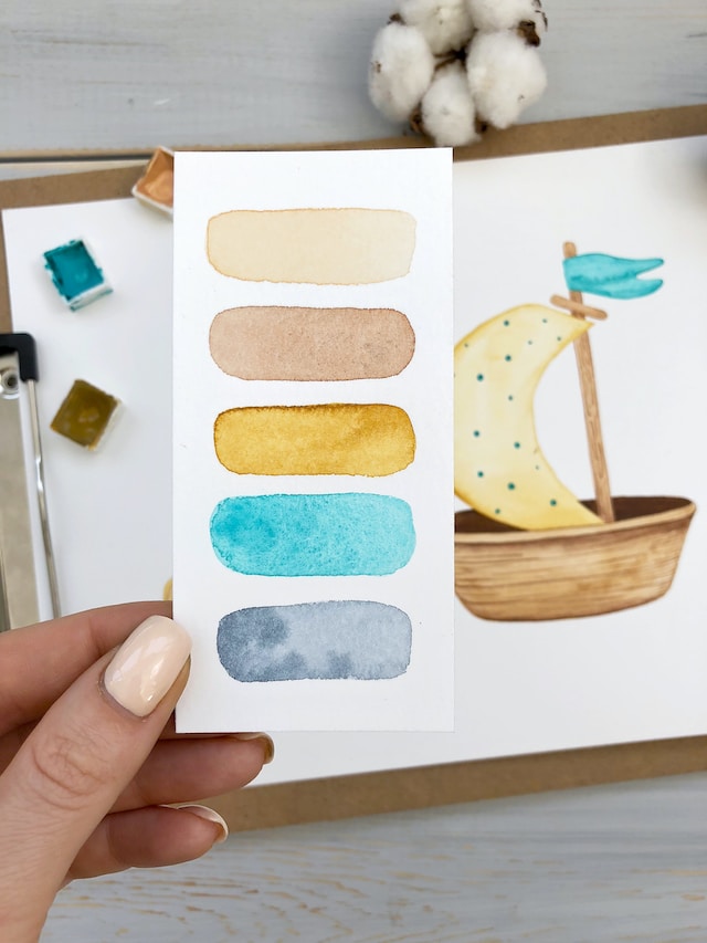
- Limit the Number of Colors: Avoid using too many colors, as it can overwhelm the design. Stick to a limited number of colors (usually 3-5) to maintain cohesiveness and simplicity.
- Test and Iterate: Test your color palette in the context of your design project. See how the colors interact with each other and whether they achieve the desired mood and visual impact. Make adjustments as necessary until you achieve the desired result.
- Use Online Color Tools: There are numerous online color tools available that can help you generate color palettes or provide inspiration. Some popular tools include Adobe Color, Coolors, and Color Hunt. These tools often offer pre-designed palettes or allow you to create custom palettes based on your preferences.
Remember that designing a color palette is subjective, and what works for one project may not work for another. Trust your instincts and use the principles of color theory as a guide, but ultimately, the right color palette will depend on your design’s context and your personal aesthetic preferences.


