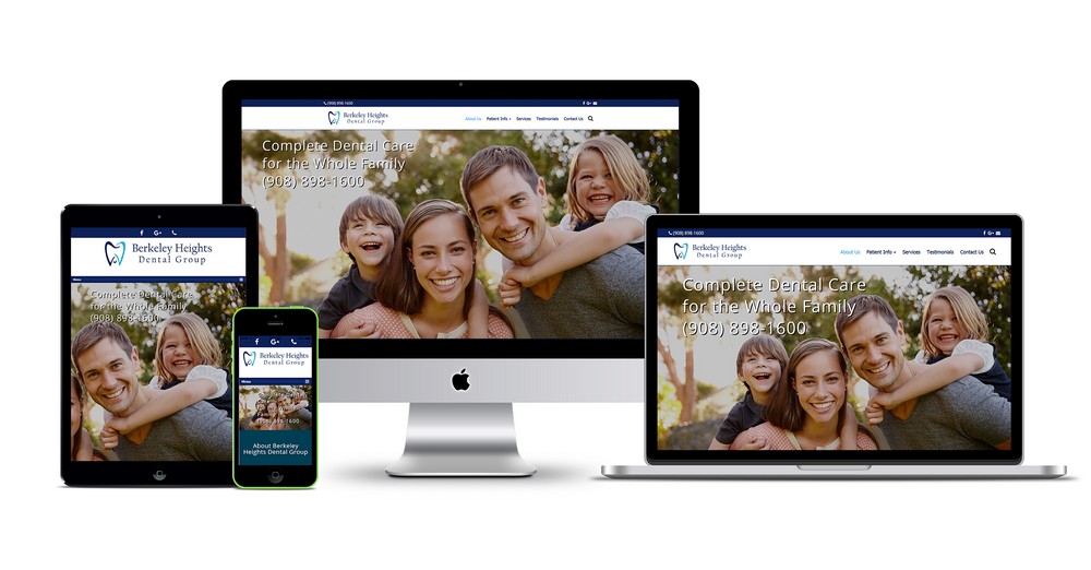
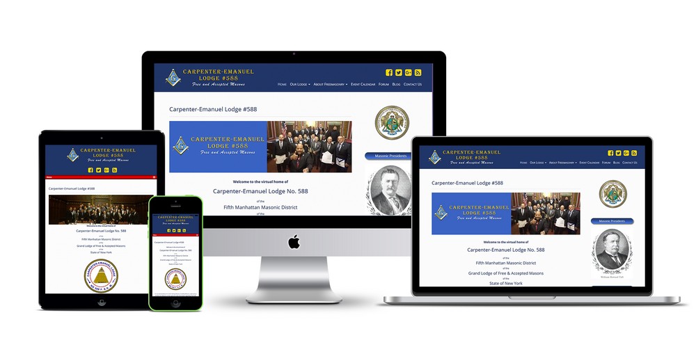
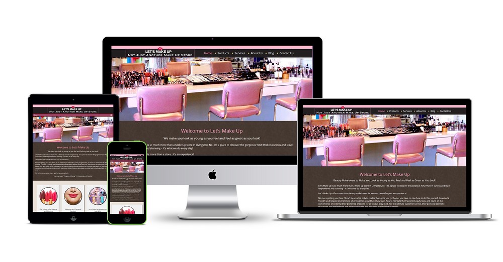
Responsive web design has become an essential element in today’s digital landscape, as users access websites from a wide range of devices, including smartphones, tablets, and desktop computers. To ensure an optimal user experience across all devices, implementing the best responsive web design practices is crucial. Here are five key practices to consider:
- Mobile-First Approach: Adopting a mobile-first approach means designing the website primarily for mobile devices before scaling up for larger screens. With the majority of internet traffic coming from mobile devices, it’s essential to prioritize the mobile experience. This approach involves optimizing page load times, using responsive images, and simplifying navigation for smaller screens. By starting with mobile design, you can ensure a smooth and user-friendly experience for all users, regardless of their device.
- Fluid Grids and Flexible Layouts: Responsive web design relies on fluid grids and flexible layouts that adapt to different screen sizes. Using relative units like percentages and ems instead of fixed pixels allows content to adjust and flow seamlessly across various devices. This flexibility enables elements such as images, text, and navigation menus to resize and reposition dynamically, ensuring they remain readable and accessible on screens of all sizes.
- Media Queries: Media queries are CSS techniques that allow you to apply different styles based on the characteristics of the user’s device. By using media queries, you can target specific screen sizes or device features and adjust the layout accordingly. This allows for the creation of breakpoints, where the design responds to different screen widths and orientations. Media queries enable the design to adapt smoothly between different layouts and provide an optimal viewing experience.
- Optimized Images: Images are a significant factor affecting the performance and responsiveness of a website. To ensure fast loading times and a smooth experience across devices, it’s essential to optimize images. This involves using responsive image techniques such as using the correct image formats (e.g., JPEG, PNG, or SVG) and employing compression techniques to reduce file sizes without compromising image quality. By using responsive images, you can deliver the appropriate image size and resolution based on the user’s device, thereby enhancing performance and user experience.
- User Testing and Iteration: Implementing the best responsive web design practices requires continuous testing and iteration. It’s crucial to test the website across multiple devices, browsers, and screen sizes to identify any inconsistencies or issues that may arise. User feedback and analytics can provide valuable insights into how users interact with the responsive design and help identify areas for improvement. Regularly reviewing and optimizing the design based on user testing and feedback ensures that the website remains responsive and user-friendly over time.
In conclusion, the best responsive web design practices involve adopting a mobile-first approach, utilizing fluid grids and flexible layouts, implementing media queries, optimizing images, and conducting user testing and iteration. By following these practices, web designers can create websites that seamlessly adapt to different devices and screen sizes, providing users with an optimal experience and ensuring the longevity and success of the website in today’s diverse digital landscape.


