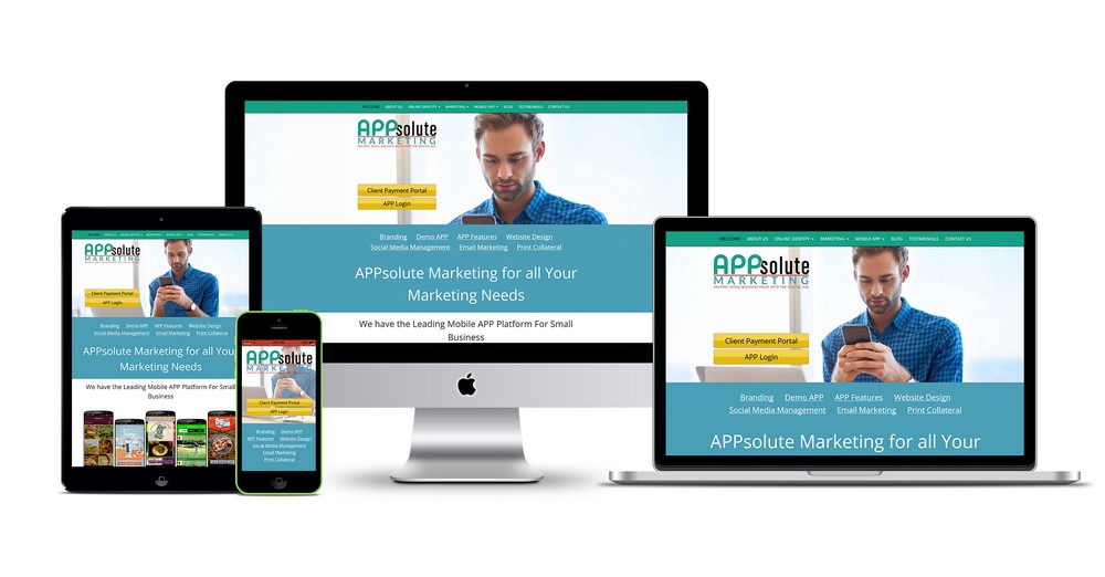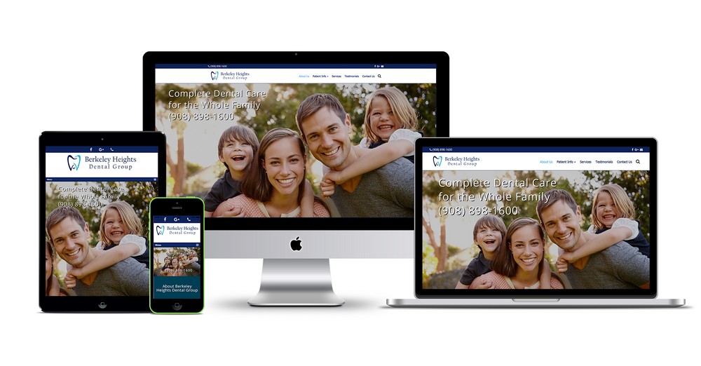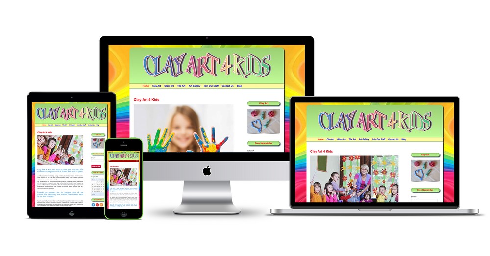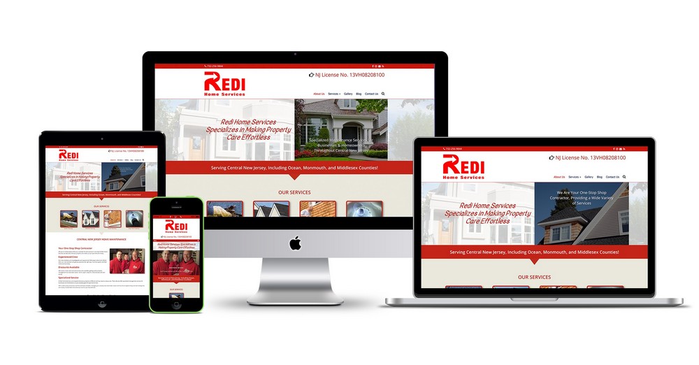
Color is one of the most powerful tools in a marketer’s arsenal. Long before a customer reads your headline, evaluates your pricing, or clicks “Buy Now,” their brain has already processed the visual aesthetics of your brand. In fact, studies show that visual cues influence up to 90% of an initial snap judgment about a product, with color accounting for a massive share of that impression.
Understanding color psychology isn’t just about making a website look pretty—it is a strategic science that taps into human emotion, drives engagement, and directly impacts your bottom line.
The Big Four: Core Colors and Their Emotional Triggers
Every color carries distinct psychological associations shaped by biology, culture, and evolution. Here is how the most common brand colors influence decision-making:
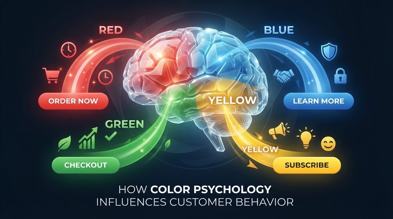
- Red (Urgency & Passion): Red accelerates the heart rate and creates a sense of urgency. It is widely used in clearance sales, “Limited Time Only” banners, and Call-to-Action (CTA) buttons to spur immediate action.
- Blue (Trust & Security): Blue evokes feelings of calm, reliability, and security. It is the undisputed favorite of financial institutions, tech giants (like Facebook and IBM), and healthcare brands because it builds immediate trust.
- Green (Growth & Harmony): Naturally linked to nature, green symbolizes wealth, health, and tranquility. Brands use it to promote eco-friendliness, financial growth, organic products, or to signal “Go” (as in checkout success).
- Yellow (Optimism & Attention): Yellow captures attention faster than almost any other color. It radiates positivity and energy, making it ideal for window displays or grabbing eyeballs—though overusing it can cause eye strain or anxiety.
Context is King: Why Contrast and Audience Matter
While general associations exist, relying on universal color rules is a mistake. The true impact of color depends heavily on two critical factors:
- Brand Context: A sleek black background works wonders for luxury fashion brands by signaling sophistication, but it would feel completely out of place for a children’s toy store, which benefits from playful, high-saturation colors.
- Target Audience Demographics: Research consistently shows that color preferences vary across genders, cultures, and age groups. For example, while blue is globally favored by both men and women, secondary preferences shift significantly. Always let data from A/B testing guide your choices rather than guesswork.
Practical Ways to Apply Color Psychology
Ready to put these insights to work on your website or marketing campaigns? Implement these actionable strategies:
- The Isolation Effect: Make your primary CTA button stand out by choosing a contrasting accent color that isn’t used anywhere else on the page. If your site is predominantly blue, an orange or red button will instantly draw the eye.
- The 60-30-10 Rule: Balance your design by allocating 60% to a dominant background color, 30% to a secondary structural color, and 10% to your accent (CTA) color to prevent visual clutter.
- Test Everything: Never assume you know what your audience wants. Run A/B tests on button colors, banner backgrounds, and checkout flows to see which palette yields the highest conversion rate.
What is the primary color palette of your current brand, and how well do you feel it aligns with the emotions you want to evoke in your customers?