We’ve all heard that you shouldn’t judge a book by its cover. It’s a lovely sentiment, but in the business world, it’s also a total lie.
In reality, your design is your silent pitch. Before a potential client reads a single word of your white paper or watches a minute of your keynote, they’ve already decided subconsciously whether you’re a heavyweight or a hobbyist.
If you want to move from “just another vendor” to “the undisputed authority,” you need to stop thinking of design as “making things pretty” and start seeing it as a strategic asset. Here is how high-end design actually builds your industry throne.
1. The “Halo Effect”: First Impressions are Final
Psychology tells us about the Halo Effect: a cognitive bias where our overall impression of a person (or brand) influences how we feel about their character.
- The Amateur Trap: Cluttered layouts, pixelated images, and “default” fonts signal a lack of resources or attention to detail.
- The Authority Move: Clean, intentional design suggests that if you care this much about your kerning, you definitely care about your client’s results.
The 50-Millisecond Rule: Research shows it takes users about 0.05 seconds to form an opinion about your website. You don’t have time to explain your expertise; you have to show it.
2. Consistency is the Proxy for Reliability
Authority isn’t just about being good; it’s about being predictable. If your LinkedIn looks like a tech startup but your website looks like a 1990s law firm, you’re creating “brand friction.”
| Feature | Amateur Design | Authority Design |
| Color Palette | Whatever looks “cool” today | Strategic colors that evoke specific emotions |
| Typography | Mix-and-match (too many fonts) | 2-3 cohesive, legible typefaces |
| Imagery | Cheesy, generic stock photos | Bespoke photography or unique brand illustrations |
| Voice | Inconsistent tone | Unified visual and verbal identity |
When your brand looks the same across every touchpoint, you signal that your processes are disciplined and your standards are high.
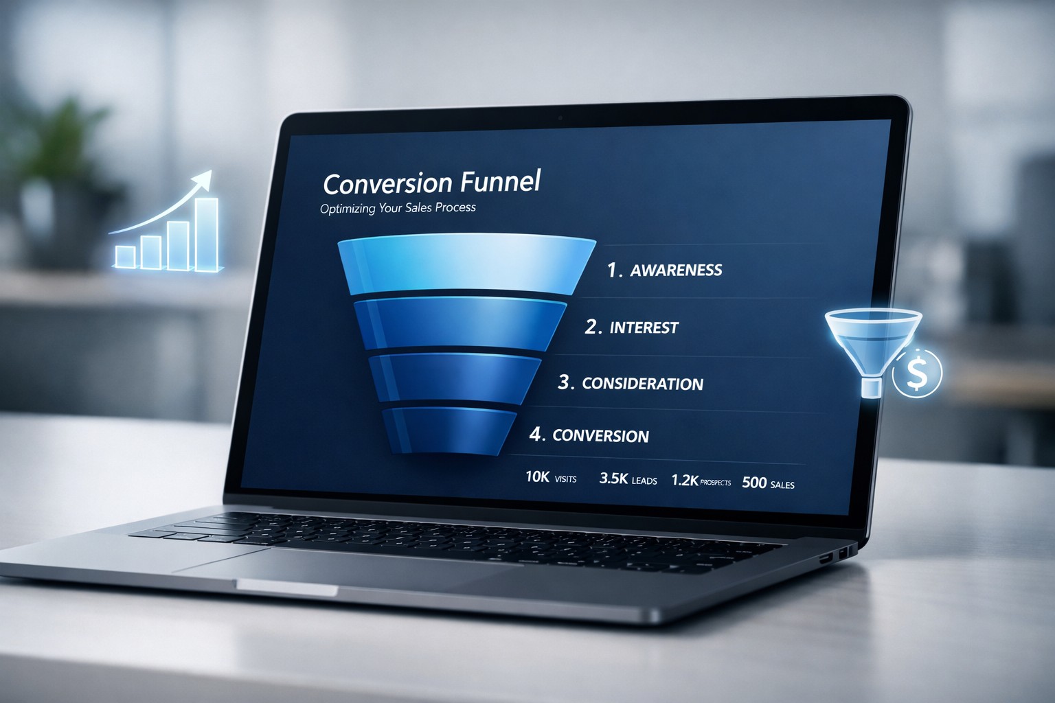
3. Data Visualization: Making Complexity Look Simple
True experts have a knack for making the complex seem simple. In design, this manifests as Information Architecture and Data Visualization.
If you can take a dense, terrifying industry report and turn it into a sleek, intuitive infographic, you have positioned yourself as the translator of your industry. You aren’t just a practitioner; you’re a thought leader. People follow the person who makes the path easiest to see.
4. Use “Design Friction” Strategically
Wait, isn’t friction bad? Not always. While a “buy now” button should be seamless, authority is often built by slowing the user down to appreciate depth.
High-authority brands often use:
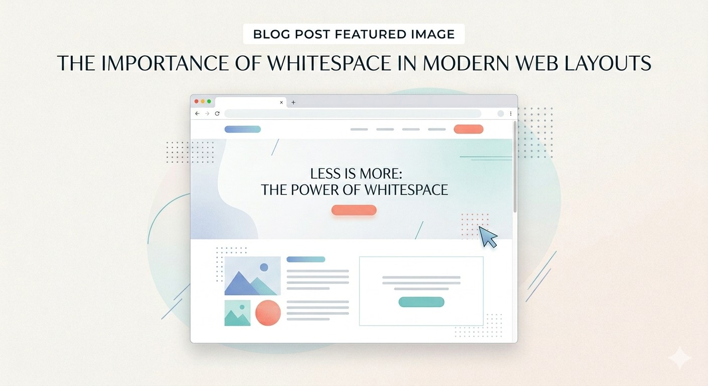
- Generous White Space: It says, “We aren’t desperate for your attention; we have room to breathe.”
- High-Quality Print Materials: In a digital-first 2026, a heavy-stock, beautifully designed physical brand book or annual report screams “Legacy.”
- Micro-interactions: Subtle animations that reward the user for exploring your site, proving that you’ve thought through the entire journey.
The Bottom Line
Design is the “uniform” of your brand. You wouldn’t show up to a multi-million dollar pitch in a wrinkled t-shirt; don’t let your digital presence do the equivalent. When your aesthetics match your expertise, the market stops questioning your price and starts respecting your position.